

Now more than ever, people are visiting your website from many different devices. You want a website that is responsive—this is the technical term for a website that changes how it displays if someone visits the site from a cell phone vs. a tablet vs. a desktop computer. A good site not only displays differently from different devices, but the navigation adjusts to a more user-friendly experience for mobile users. And a simple user experience is now more important than ever—did you know that mobile pages with a bad searcher experience can rank lower in Google as a result?
Do you know if your site is mobile friendly? Now it’s easier than ever to find out, by using Google’s easy new tool.
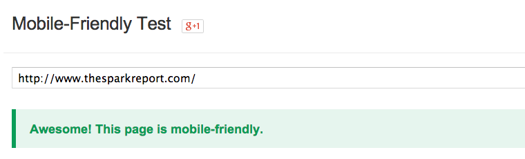
1. Visit Google’s mobile friendly test page.
2. Enter your website in the search bar.
3. Eagerly await your results, which will display within minutes!
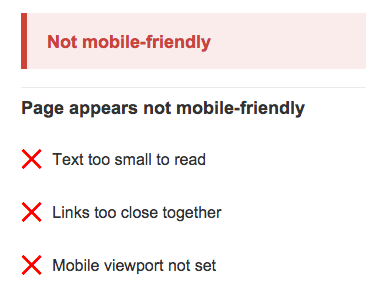
Google will then show you how your site appears on a mobile device. If Google tells you the site does not pass the mobile-friendly test, it will list the red flag indicators:
You then can either take the time to figure out how to update, re-code, or redo your website after gathering a working knowledge of mobile SEO. (I can hear your inner thoughts now: “Ain”t nobody got time for that!”) Or you can give us a call to find out how we can work with you to build a beautiful, new mobile-friendly and responsive site for you.
Contact us today!