
Two steps forward, one back. But hey, at least there is progress on improving the editing ease of WordPress websites. And don’t be fooled by the headline — these complications are short-term. Once you go through the initial difficulties, editing websites gets back to being easier. Well, for now at least.
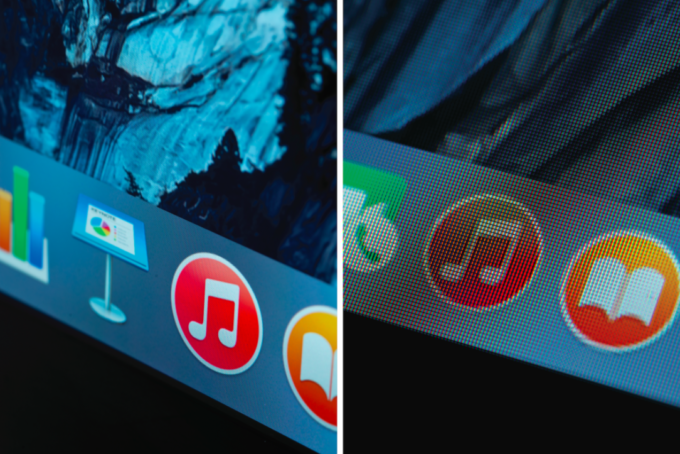
The newest setback is how WordPress handles retina displays. Currently, they don’t. Regardless of the device used to view a website, WordPress feeds the correct sized image to the device, based on its size. WordPress does not have a separate feed for retina displays though.
This matters because retina displays are designed to show incredibly sharp photos. But to use the technology to its fullest, the website needs to feed the retina-ready device an image that is double the resolution of the images that are stored in WordPress’ media library. If a retina display is pulling in a non-retina image, it will appear blurry. But if you load all images at a resolution that’s good for retina displays, then the higher resolution will cause the images to load much more slowly on normal devices. That’s not good at all.
Enter the Adaptive Imaging System that is connected with a few WordPress themes.
With this system, images get generated in various sizes and resolutions just like before, but now there’s another set of identically-sized images that are generated for retina displays at double the resolution. Once implemented, any retina display that pulls images from the media library will automatically pull the retina-sized image necessary to take advantage of the higher resolution.
The downside to all of this is that the process reverses what was common practice before and caused us to do a lot more work to make the site retina-ready. We no longer need to load “web-sized” images, but rather full images regardless (almost) of the actual size of the file. That’s a huge plus for future sites, but it created a problem with the existing website. Since high resolution images were not already in the media library, we had to reload all of the same images already on the site in a much higher size. Where the limit used to be 2,400 pixels wide, it’s now 4,800 pixels wide. Fortunately we kept all of the high resolution images that were originally used to create the lower resolution images for the website and were able to load those in order to generate the various regular and retina images.
But in the end, the effort was worth it. The images on our client’s website are extremely sharp on any device — retina included. Take a look for yourself by visiting the site.